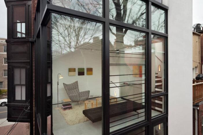
Row houses are characterized by their thin and long floor plans. Squished into city blocks, these homes tend to be tall (three stories is common) and only get light from their front and rear sides. The odd layout can present challenges when it comes to decorating, such as furnishing narrow spaces and promoting light and air flow. However, you can still create a balanced space in your row house with these decorating tips:
Row houses need light – Keep the line of sight open
To help light reach the center of your home, avoid decorating with obstructive pieces. Tall bookcases, screens and high-back chairs can all impede light flow. Instead of sticking these pieces in the way of your windows, be sure to align them parallel with the run of your home. That way, the narrowest part of your pieces will obstruct light flow, cutting back on how much illumination you block and keeping sightlines open. Additionally, keep tall items against your walls.
You can also promote light flow by using transparent furniture. Clear tables and chairs are trending right now, so incorporating those into your row home will not only allow light and your eyesight to move from one end of the room to the other, but it will also modernize your space. See-through surfaces also help open up the feel of the place, as will strategically placed wall mirrors.
Terraced houses are confining – Move traffic flow to one side
The layout of row homes is such that to get from one space to another, you must pass through a bunch of areas. To get to the kitchen in the back, you probably move through a living and dining room. As such, traffic flow becomes a huge priority. Help ease movement in your home by keeping your living spaces on one side of the room and passages on the other.
You might arrange your sofa and chairs against the wall while the other side of the living room is for walking. Or, traffic could move against the wall. Use doorways to inform you where natural walkways should fall. In rooms where doors aren’t aligned, put furniture in the corner so you can walk across the space.
Decorate with degrees – Don’t settle for straight angles
While tall furniture should be parallel to the run of your home, lower pieces can be perpendicular or at a 45-degree angle. In fact, changing angles helps to break up the long space and make the room feel wider. Just be sure not to block walkways.
Shape up your brownstone house
You might be tempted to put a long coffee table in your narrow living room, but consider other shapes first. For instance, circular surfaces can break up the room and add visual interest. Round accent and coffee tables are great options to soften the straight lines of row houses. Other decor pieces, such as pillows, lamps and ottomans, look great in circular shapes as well.
Make use of odd spaces – Add vertical storage
Use tall, rather than wide, furniture in your home to make use of vertical space. Additionally, don’t give up on those strange corners or nooks – they can give you additional space in your home. In fact, look for custom furniture to fit in those areas, or use the pieces you have in creative ways. That little alcove in your living room could become a cozy book nook. A corner hutch works perfectly to take the visual edge off, while providing much-needed space-saving shelves and drawers.
Don’t forget the outside of your townhouse
Even though you may have a tiny patio, balcony or backyard, there are still many ways in which you can enhance the look and feel of your rowhouse. Add a built-in storage bench and a chiminea to create a cozy outdoor nook. Wall-mounted planters or ivy can bring a touch of nature to a small urban exterior without taking up any floor space at all. If you have a green thumb, you might try your hand at a manicured English garden-inspired plot between homes or in a fenced-in area out back. It’s an intimate setting for a bistro table and chairs with a stone pathway leading to it. Rustic urns and statues are another way to bring subtle style. Just be wary of overcrowding your outdoor space with too much garden furniture and accents, as less is more when it comes to creating a charming backyard getaway.
Photo Credits
- David Jameson Architect, Barcode House


Leave a Reply